Fraser and Fusebox, Final Roundup
In the words of yellow arrow Andrew Wodzianski:
"Should I kill myself now?"
With next month's closing of two prominent DC galleries there is this temptation to climb the new Woodrow Wilson Bridge scaffolding--it looks beautifully gothic at night--and toss oneself atop some iron brace spike. Why then should we go on living life and arting art without Fusebox and Canal Square Fraser?
Their last two shows of course.
Last Friday's opening of Bruce Erickson at Fraser was understated. I don't think Kate's sangria got kicked by the end of the night. But for those who dropped by it was worthwhile, with the mood raised by some cool children who studied visitors as they studied Erickson--I don't think they touched the mix but it would explain the levity.
Erickson won the 2004 Georgetown International Fine Arts Competition, and here he stretches himself to show versatility with contrasting figure and non-figure work. The former has warmth, the latter does not. And those works prove interesting, even arresting.
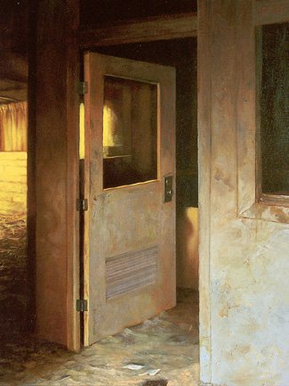
Though tonally warmer and almost pastelish, the desolate interiors of Erickson's Dixmont State Hospital keep the space cold. There is a fight within each work, a push from the warm side and then a puch from the blank interior. It keeps the frame dynamic and stops the visitor from going static.
Canal Square itself has seen its galleries dwindle form eight to four in the past years and Erickson's empty spaces are a knowing nod goodbye as Fraser moves on.
______________________ _ _ __ _ _ _ _ _ _ _
The last time I saw Vesna Pavlovic's work was last year at a damn thorough artist talk at St. Mary's--olympic photographs, street photography, and contrasty black and whites of March Madness spectators. I had the chance to have a studio visit with Vesna and her input was invaluable.
So I'm scratching my head now after her show of
 the geometric abandoned interiors of Belgrade hotels. The show is worth stopping by and not without Pavlovic's incredible composition--but technical flaws are abound.* I am really cluless as to why each photograph's grain was large and overwhelmingly prevalent. The cold clean look of these interiors is runied as soon as one steps within a few feet of the work and sees the spotty, punchy grain.
The photograph's come in editions of five and, at the time of my visit last Saturday, no set had sold out. It seems related only to me, I'm sure. So someone with more experience--that is, almot all of you--please explan what I am missing.
*Anyone who knows my work knows it is full of these technical issues so I focus on this cause I know how much from experience those issues can just fuck up a work .
posted by adrian at 2:29 PM
![]()
![]()

0 Comments:
Post a Comment
<< Home